AIVANA
Visual identity for an AI-powered EdTech brand designed to make learning smarter and more human — built around clarity, knowledge, and progress.
The brief, the bet, the delivery.
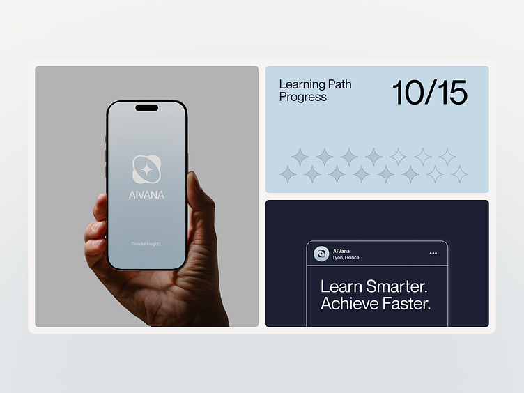
AIVANA is an AI-powered EdTech brand designed to make learning smarter and more human. The identity blends modern minimalism with a sense of clarity and progress — reflecting how the platform grows with learners step by step.
EdTech branding often defaults to either corporate-blue institutional cues or playful kid-tech aesthetics. AIVANA needed a visual identity that felt intelligent and calm — grounded in real knowledge — while still reading as warm, human, and something learners of any age would want to return to.
We built the system around three words: Clarity, Knowledge, Progress. Minimal typography, open sky imagery, and a palette anchored in soft blue-greys (#B7C5CE, #D8DCDE, #A0B6D0, #6F8A9C) with deeper navy (#25426B) and charcoal (#030408) for weight. Warmer mid-tones (#647E92) bridge the system so the brand never tips fully cold.
A modern minimal identity that feels like a clear-sky morning — confident, unhurried, and built to grow alongside learners. The visual language moves fluidly between marketing, product, and social while keeping the three anchor words doing the heavy lifting.